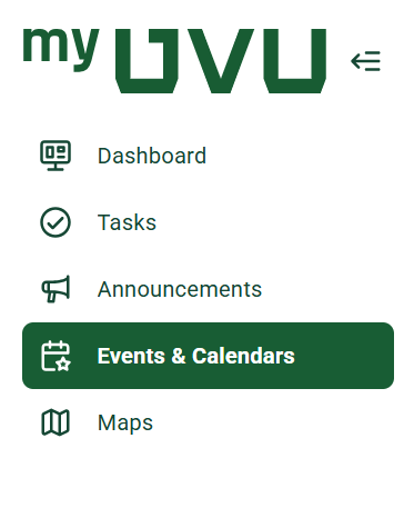
Why does the navigation look different?
With the move to a new platform, some layout changes are necessary. Pathify uses a side navigation design, which helps keep tools and resources easy to access and consistent across both desktop and mobile.
While the navigation may look different at first, it’s designed to be simple, intuitive, and easy to learn. If you ever have trouble finding something, you can use the search bar located in the top-left corner of the screen to quickly locate tools, pages, and resources.
Where did my favorite links/tools move?
Some tools and links have new homes, and we understand that adjusting to a new layout can take a little time. We’ve worked to organize content in a way that makes things easier to find and more consistent.
Here are a few helpful tips:
If you’re having trouble locating something, we encourage you to submit feedback so we can continue improving the experience.
Can I customize what I see on my dashboard?
Yes — to an extent! This is one of the features we’re most excited about. You’ll be able to personalize parts of your dashboard by adding, removing, rearranging, or resizing certain items.
Some core features will remain fixed so that important information is always easy to find, but you’ll have flexibility to tailor much of your dashboard to fit your needs and preferences.
Is there a search function, and how does it work?
Yes — Pathify includes a built-in search feature that allows you to quickly find tools, pages, and resources. The search works using keywords, so typing in the name of a tool, service, or topic will help you locate related content.
The search bar is located in the top-left corner of the screen and is often the fastest way to find what you’re looking for.