

353 Using components for formatted content
What are components?
Components are a feature of Modern Campus CMS that allows for inserting and editing content that is easy to maintain, and which is automatically formatted to a certain design. Components allow for content of site elements to be edited separately from the design of the element, via form fields, which keeps the formatting in tact. They are especially useful for adding site elements with more complex styling than can be easily maintained in the editor.
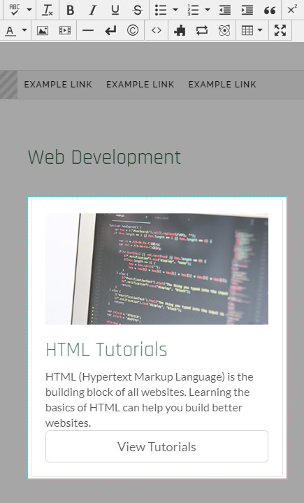
Web & Mobile Solutions builds and maintains a collection of components that can be added to pages. Component types include content cards, picture cards, event listings, and directory cards. Many components have multiple design options that can easily be chosen via a drop-down when creating or editing the component.
The underlying structure of each type of component is built by Web & Mobile Solutions. When a component is added to a page, that underlying structure is populated with content specific to that page, and becomes unique to that page. However, when changes are made to the underlying structure of a component, those changes will be pushed to any component of that type across the site. In that case, the content of the component stays the same, while the underlying structure may change.
Adding components to pages
Multiple components may be added to a single page. To add a component to a page:
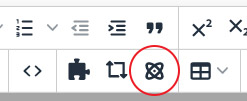
- Place the cursor where you would like the component to appear. Click on the "Insert
Component" icon from the editor toolbar.
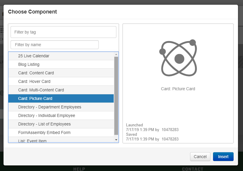
- From the window that appears, choose the component type that you would like to insert.
To see the component options, visit the Elements Library.
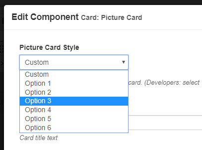
- After choosing the component type, a window will appear for entering the content and
options for that component. Many component types have a drop-down list of different
available styles. If the component you have chosen has this drop-down, choose the
option style you would like to use. You may change the style later. To see different
styles of components, visit the Elements Library.
- Fill out the remaining fields with content and options for the component.
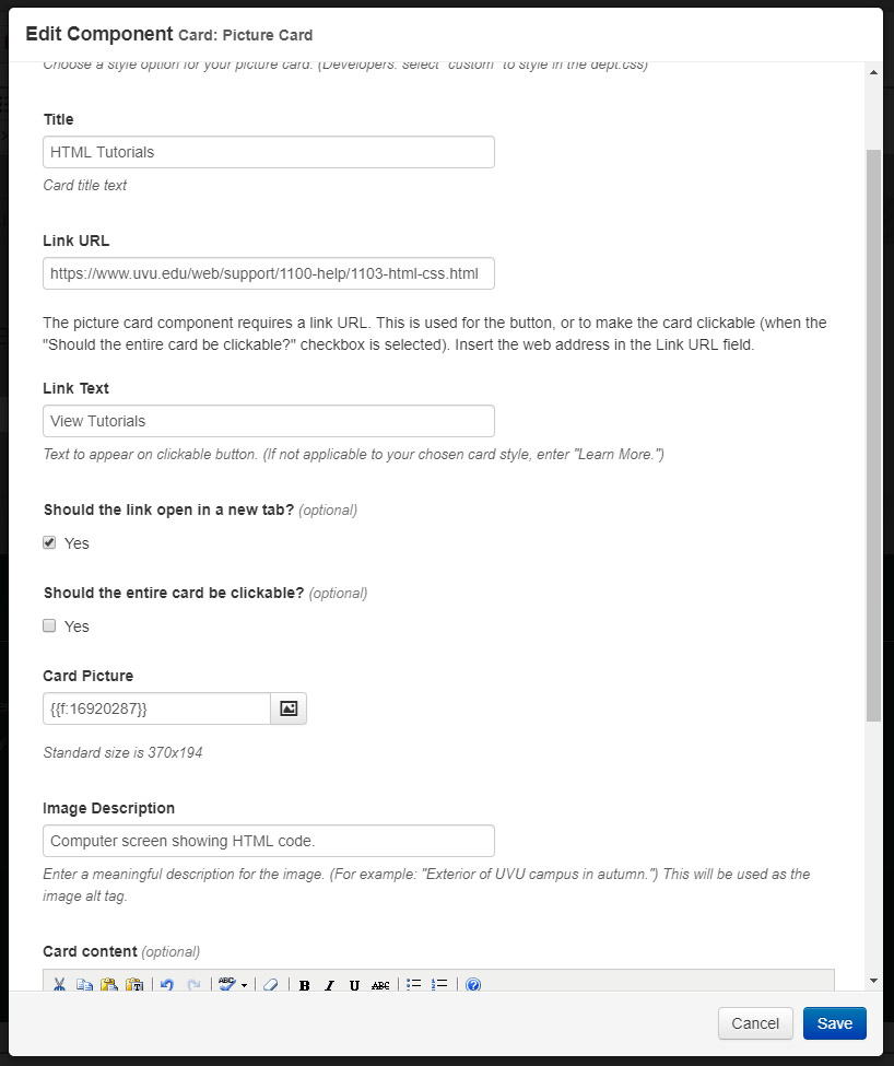
- Save the component to add it to the page.
- After inserting the component, the editor will give a visual representation of many
(but not all) component types.
- To edit the component, click on the component, then click on the pencil icon that
appears underneath the component.
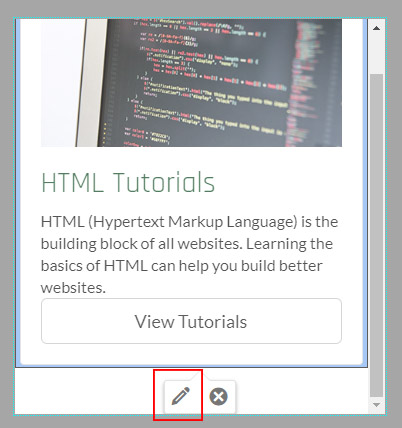
- To delete a component, click on the component, then click on the "X" icon that appears underneath the component.
- Save and publish your page when your changes are complete.
Working with components: video tutorial
This video tutorial shows how you can work with components and add them to your sites.